
The Tiny Dot That Changed Everything: Unraveling the Mystery of the Dots on i and j
In the vast alphabet we use every day, few elements spark curiosity like the humble dot perched atop the lowercase “i” and “j.” Called a tittle (from the Latin titulus, meaning “title” or “superscript”), this minuscule mark has shaped writing, printing, and even digital communication for centuries.
Why does it exist? Where did it come from? And why do “i” and “j” share it while other letters don’t? Let’s dive into this overlooked punctuation powerhouse, exploring its origins, evolution, cultural twists, and surprising modern relevance.
Picture medieval scribes hunched over manuscripts, their quills scratching vellum. Without the dot, lowercase “i” looked like a simple vertical stroke easily lost in dense text or mistaken for “l,” “u,” or “n.”
The dot emerged as a practical fix around the 11th century in Latin manuscripts, particularly in regions like Ireland and France.
Early Irish monks, known for their intricate script, added a sharp accent called an acute to distinguish the “i” sound.
Over time, this evolved into a neat dot.By the 14th century, printers like Johannes Gutenberg standardized it. His movable type Bible (1455) featured dotted i’s, ensuring clarity in mass-produced books.
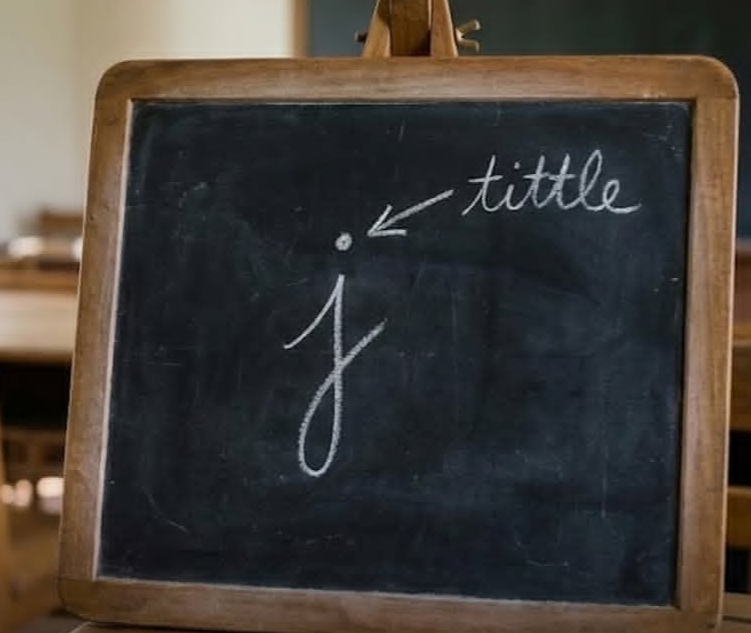
The “j” joined later originally a swash variant of “i” used in Roman numerals (like “ij” for 2). In the 16th century, Pierre Ramus, a French scholar, proposed separating “i” and “j” as distinct letters: “i” for vowels, “j” for consonants. The dot migrated to both, cementing their partnership.
Fun fact:
In some early English texts, “j” was just a fancy “i,” as in “Jesus” written as “Iesus.”This evolution wasn’t uniform. Languages adapted the tittle uniquely Spanish and French kept it simple, while Turkish added a dotless “ı” and dotted “I” to match vowel harmony. Icelandic dots its “í” with an acute accent, blending tittle with diacritic flair.
Linguistic Adventures: Why the Dot Sticks Around (and Sometimes Doesn’t)
Fast-forward to linguistics: the tittle isn’t just decoration; it’s a readability hero. In typography, it’s part of counterforms the negative spaces that make letters recognizable at speed.
Without it, “ill” becomes a blurry mess; with it, distinction snaps into focus. Studies from the readability lab at MIT show undotted i’s slow reading by up to 10% in low-contrast text.But the dot’s story gets wild across languages.
In Arabic, the dot distinguishes “ب” (b) from “ت” (t) proving dots are universal problem-solvers. Hebrew uses niqqud dots for vowels, echoing the tittle’s role. Even in non-Latin scripts, like Thai’s tone marks or Devanagari’s matras, similar superscript dots clarify pronunciation.
Enter the “j.” Born from “i” around 1524 in Italian printing, it gained its tail flourish for handwriting elegance. Yet in Danish and Norwegian, “j” sounds like English “y,” as in “ja” (yes). Dutch dots both but pronounces “j” as a throaty “h.” In Polish, dotted “j” is “yot,” a pure consonant.
This variance highlights how one mark serves diverse phonemes.Cultural quirks abound. Matthew 5:18 in the Bible famously says, “not one jot or one tittle shall pass from the law”—where “jot” derives from iota (Greek “i”), underscoring the dot’s biblical permanence.
In pop culture, the tittle inspired the band name “Tittle” or even debates in The Simpsons font parodies.Designers obsess over it. Helvetica’s tittle is a perfect square; Comic Sans rounds it playfully.
In logo design, Apple’s dotted “i” in iPhone nods to innovation simple yet iconic.
Digital Dots, Emojis, and the Future: From Pixels to Unicode WarsToday, the tittle battles screens.
In early digital fonts like Courier, dots were blocky squares; now, variable fonts like Inter scale them flawlessly across devices. But glitches persist think Turkish “i” woes in English keyboards, where capital “İ” (with dot) confuses software, causing hilarious autocorrect fails like “İstanbul” becoming “Istanbul.”Unicode codifies this chaos: U+0069 (i), U+006A (j), with dotted capitals İ (U+0130) and J.
Emoji add flair dotted “💩” (pile of poo) or “👁️” (eye) but the plain dot endures in texting. Leetspeak hackers replace it with “!”, as in “h4ck3r,” subverting its purpose.
Looking ahead, as we embrace cursive-less typing and AI fonts, will the tittle fade? Unlikely. Dyslexia fonts like OpenDyslexic enlarge it for clarity. In VR/AR, spatial dots could evolve into 3D hover effects.Ultimately, this tiny dot reminds us language is alive adapting from quill to quantum screens.
Next time you type “just imagine,” tip your hat to the tittle: the unsung guardian of clarity.What small letter quirk fascinates you most?